
This is the second of a series of articles that I will write to give a gentle introduction to statistics. In this article we will cover how we can visualize data using various charts and how to read them. I will show how to create these charts using Python and will include code snippets as well. For a full version of the code visit my GitHub repository.
Python has many libraries that allow creating visually appealing charts. In this article we will work with the in-built tips dataset and then plot using the following libraries:
import seaborn as sns
tips = sns.load_dataset("tips") # tips dataset can be loaded from seaborn
sns.get_dataset_names() # to get a list of other available datasets

import plotly.express as px
tips = px.data.tips() # tips dataset can be loaded from plotly
# data_canada = px.data.gapminder().query("country == 'Canada'")

import pandas as pd
tips.to_csv('/Users/vivekparashar/Downloads/tips.csv') # we can save the dataset into a csv and then load it into SAS or R for plotting

import altair as alt

import statsmodels.api as sm
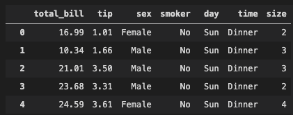
Lets take a quick look at how the tips dataset is structured:
We will cover the following charts in this article:
- Dot plot shows changes between two (or more) points in time or between two (or more) conditions.
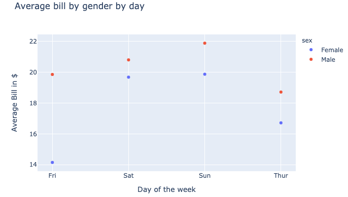
# Using plotly library
t = tips.groupby(['day','sex']).mean()[['total_bill']].reset_index()
px.scatter(t, x='day', y='total_bill', color='sex',
        title='Average bill by gender by day',
        labels={'day':'Day of the week', 'total_bill':'Average Bill in $'})
- Bar (horizontal and vertical) chart is used when you want to show a distribution of data points or perform a comparison of metric values across different subgroups of your data.
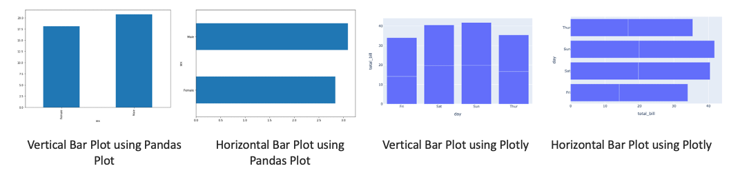
# Using pandas plot
tips.groupby('sex').mean()['total_bill'].plot(kind='bar')
tips.groupby('sex').mean()['tip'].plot(kind='barh')

# Using plotly
t = tips.groupby(['day','sex']).mean()[['total_bill']].reset_index()
px.bar(t, x='day', y='total_bill') # Using plotly
px.bar(t, x='total_bill', y="day", orientation='h')
- Stacked Bar char is useful when you want to show more than one categorical variable per bar
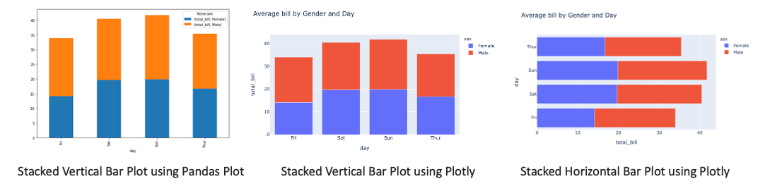
# using pandas plot; kind='barh' for horizontal plot
# need to unstack one of the levels and fill na values
tips.groupby(['day','sex']).mean()[['total_bill']]\
        .unstack('sex').fillna(0)\
        .plot(kind='bar', stacked=True)

# Using plotly
t = tips.groupby(['day','sex']).mean()[['total_bill']].reset_index()
px.bar(t, x="day", y="total_bill", color="sex", title="Average bill by Gender and Day") # vertical
px.bar(t, x="total_bill", y="day", color="sex", title="Average bill by Gender and Day", orientation='h') # horizontal
- Boxplot (horizontal and vertical) In a box plot, numerical data is divided into quartiles, and a box is drawn between the first and third quartiles, with an additional line drawn along the second quartile to mark the median. In some box plots, the minimums and maximums outside the first and third quartiles are depicted with lines, which are often called whiskers.
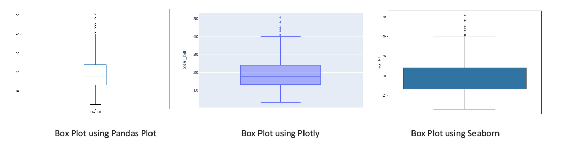
# using pandas plot
# we specify y=variable for vertical and x=variable for horizontal for horizontal box plot respectively
tips[['total_bill']].plot(kind='box')

# using plotly
px.box(tips, y='total_bill')

# using seaborn
sns.boxplot(y=tips["total_bill"])
- Violin plot is a variation of box plot
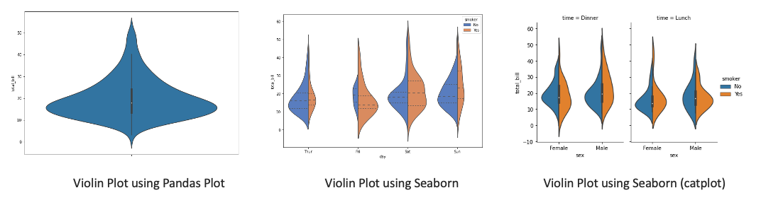
# Using seaborn
sns.violinplot(y=tips.total_bill)
sns.violinplot(data=tips, x='day', y='total_bill',
        hue='smoker',
        palette='muted', split=True,
        scale='count', inner='quartile',
        order=['Thur','Fri','Sat','Sun'])

sns.catplot(x='sex', y='total_bill',
        hue='smoker', col='time',
        data=tips, kind='violin', split=True,
        height=4, aspect=.7)
- Histogram is a visual representation of the frequency distribution of your data. The frequencies are represented by bars.
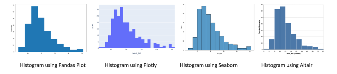
# using pandas plot
tips.total_bill.plot(kind='hist')

# using plotly
px.histogram(tips, x="total_bill")

# using seaborn
sns.histplot(data=tips, x="total_bill")

# using altair
alt.Chart(tips).mark_bar().encode(alt.X('total_bill:Q', bin=True),y='count()')
- Probability Plot is a way of visually comparing the data coming from different distributions. It can be of two types - pp plot or qq plot
- pp plot (Probability-to-Probability) is the way to visualize the comparing of cumulative distribution function (CDFs) of the two distributions (empirical and theoretical) against each other.
- qq plot (Quantile-to-Quantile) is used to compare the quantiles of two distributions. The quantiles can be defined as continuous intervals with equal probabilities or dividing the samples between a similar way The distributions may be theoretical or sample distributions from a process, etc.
- Normal probability plot is a case of the qq plot. It is a way of knowing whether the dataset is normally distributed or not
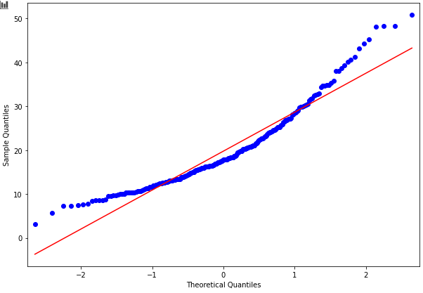
# using statsmodels
import statsmodels.graphics.gofplots as sm
import numpy as np
sm.ProbPlot(np.array(tips.total_bill)).ppplot(line='s')
sm.ProbPlot(np.array(tips.total_bill)).qqplot(line='s')
- Scatter plot shows the relationship between two numerical variables.
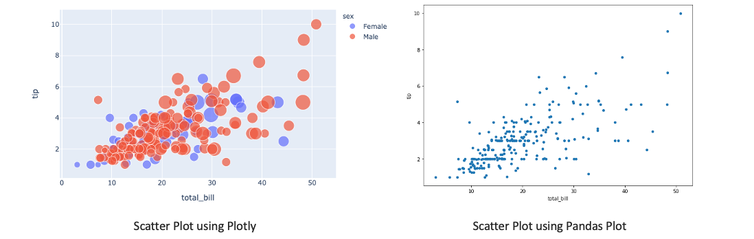
# using plotly
px.scatter(tips, x='total_bill', y='tip', color='sex', size='size', hover_data=['day'])

# using pandas plot
tips.plot(x='total_bill', y='tip', kind='scatter')
- Reg plot creates a regression line between 2 parameters and helps to visualize their linear relationships
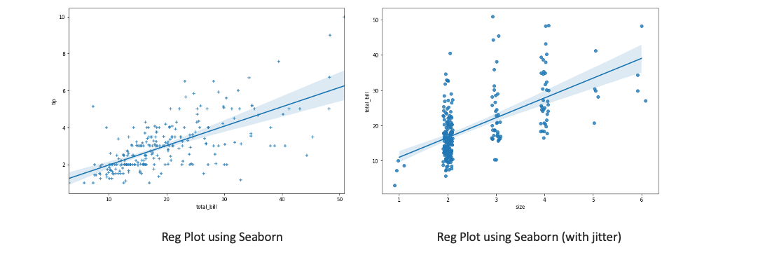
# using seaborn
sns.regplot(x="total_bill", y="tip", data=tips, marker='+')

# for categorical variables we can add jitter to see overlapping points
sns.regplot(x="size", y="total_bill", data=tips, x_jitter=.1)
- Line plot is used to visualize the value of something over time
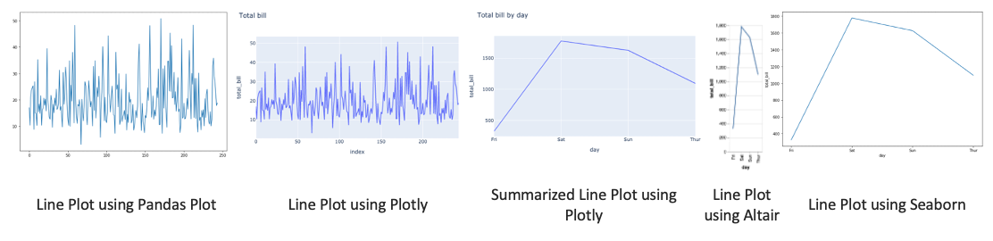
# using pandas plot
tips['total_bill'].plot(kind='line')

# using plotly
px.line(tips, y='total_bill', title='Total bill')

t = tips.groupby('day').sum()[['total_bill']].reset_index()
px.line(t, x='day',y='total_bill', title='Total bill by day')

# using altair
alt.Chart(t).mark_line().encode(x='day', y='total_bill')

# using seaborn
sns.lineplot(data=t, x='day', y='total_bill')
- Area plot is like a line chart in terms of how data values are plotted on the chart and connected using line segments. In an area plot, however, the area between the line segments and the x-axis is filled with color.
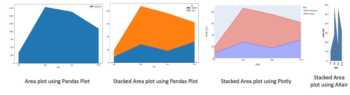
# using pandas plot
tips.groupby('day').sum()[['total_bill']].plot(kind='area')

# stacked area can be done using pandas.plot as well
t = tips.groupby(['day','sex']).count()[['total_bill']].reset_index()
t_pivoted = t.pivot(index='day', columns='sex', values='total_bill')
t_pivoted.plot.area()

# using plotly
px.area(t, x='day', y='total_bill', color='sex',line_group='sex')

# using altair
alt.Chart(t).mark_area().encode(x='day', y='total_bill')
- Pie chart is a circular statistical graphic, which is divided into slices to illustrate numerical proportion. In a pie chart, the arc length of each slice, is proportional to the quantity it represents.
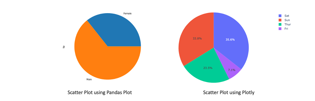
# using pandas plot
tips.groupby('sex').count()['tip'].plot(kind='pie')

# using plotly
px.pie(tips, values='tip', names='day')
- Sunburst chart is ideal for displaying hierarchical data. Each level of the hierarchy is represented by one ring or circle with the innermost circle as the top of the hierarchy.
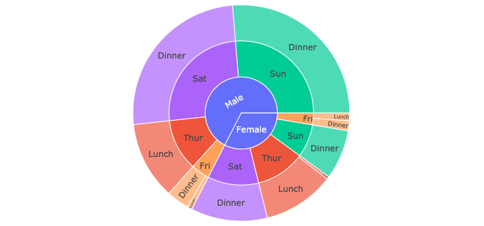
px.sunburst(tips, path=['sex', 'day', 'time'], values='total_bill', color='day')
- Radar chart is a graphical method of displaying multivariate data in the form of a two-dimensional chart of three or more quantitative variables represented on axes starting from the same point.
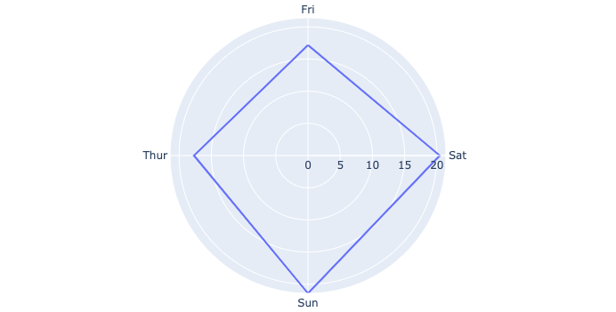
# using plotly
t = tips.groupby('day').mean()[['total_bill']].reset_index()
px.line_polar(t, r='total_bill', theta='day', line_close=True)
The best way to get better at visualization is through practice. What I have found useful is participating in a weekly visualization challenge called the TidyTuesday!
Comments welcome!